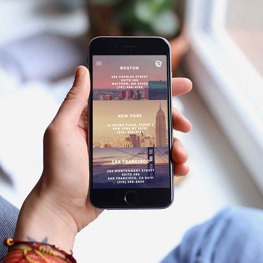
Design a responsive website that easily directs the user to the two most desired calls to action: to contact and to hire. Highlight how they are different from other PR agencies and what makes working with them a unique experience.
Research the top priorities and variables that influence potential and current client needs when searching for PR services. Allow those factors to become the main CTAs on the homepage for easy, one-click decisions and access top priority, influential information about the agency. Create an art direction that reflects the company’s unique culture and relevance to the current social media space.
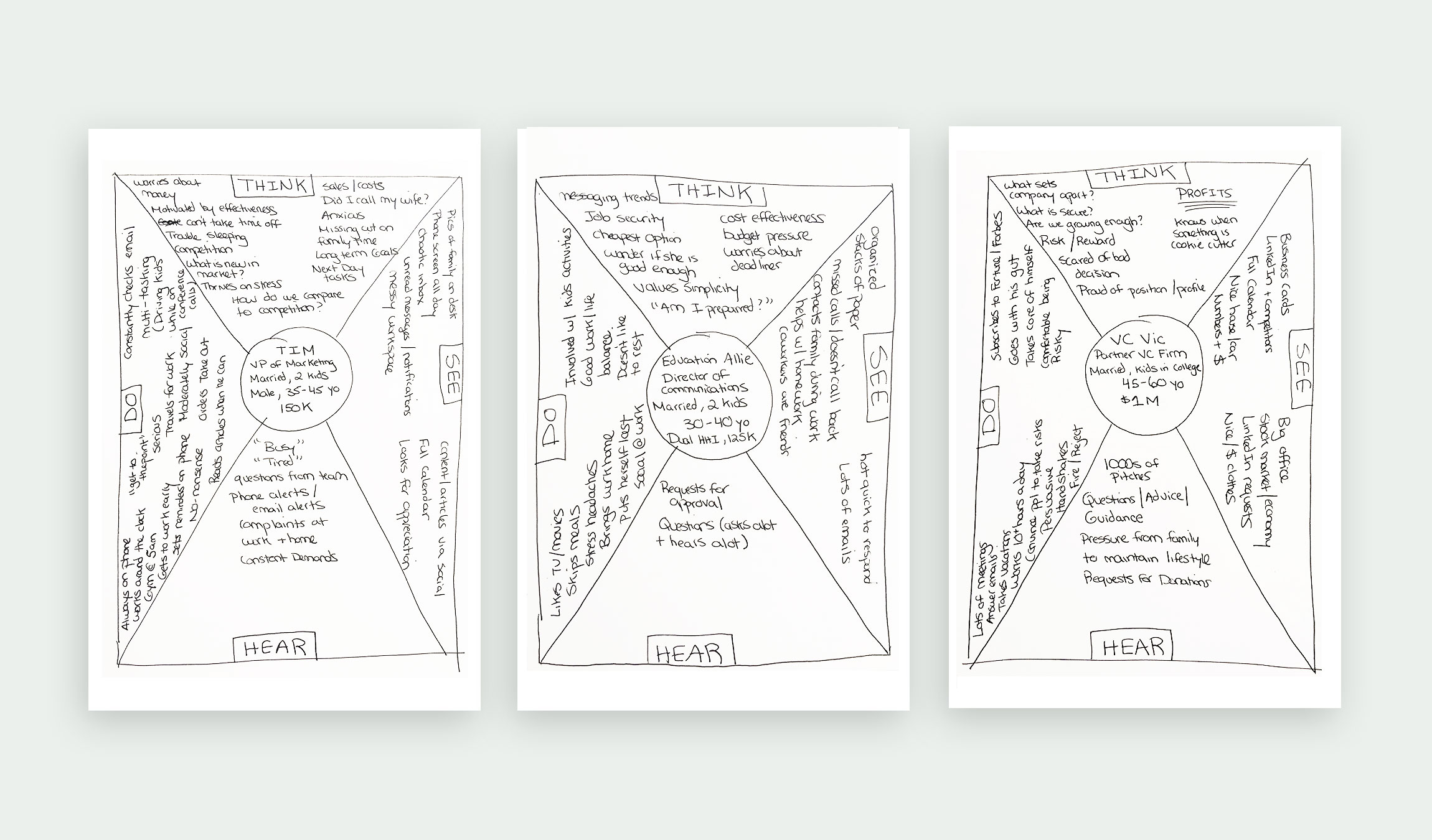
Included are the top 3 personas: 1. VP of Marketing 2. Director of Communication in Education 3. VC Firm Partner. Each persona was explored through empathy mapping to gain insight on what they experience in their job roles, the demands they face, and how InkHouse could solve their PR challenges. This allowed for a deeper understanding of their daily frustrations and emotional drivers from both in and outside of work. Collectively, all 3 personas were strapped for time with little tolerance for extraneous information or wandering.
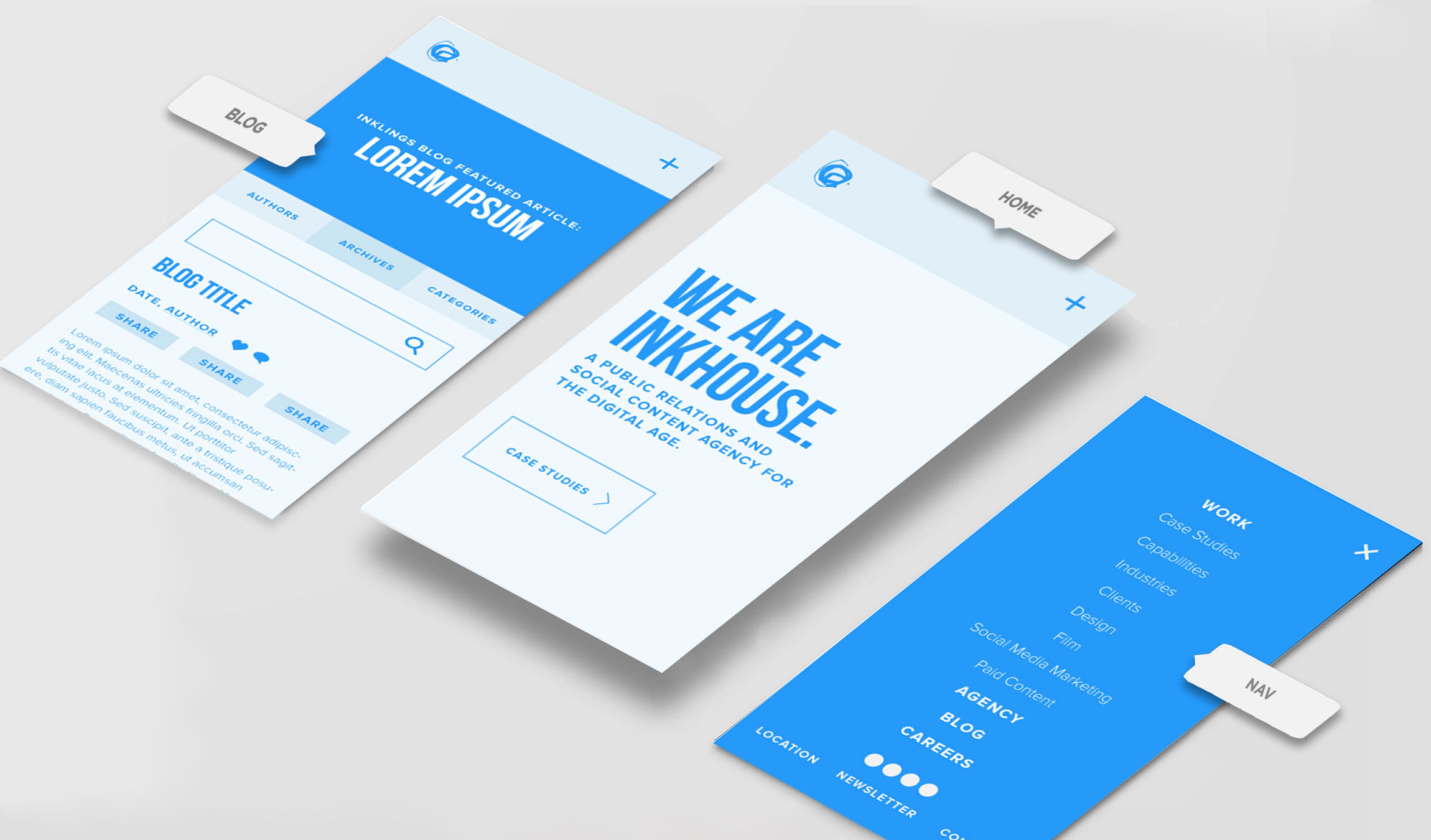
After persona exploration, the best solution was to include a single CTA button on the homepage directing to Case Studies which achieves multiple goals, including, how an integrated campaign looks, the client list, and a preview for what the process entails. This is vital information that greatly influences the user's decision to contact the agency and move forward. The blog is also a huge area for traffic and to elevate the shareability of the posts, an automatic social share function was added whenever any post text is highlighted.
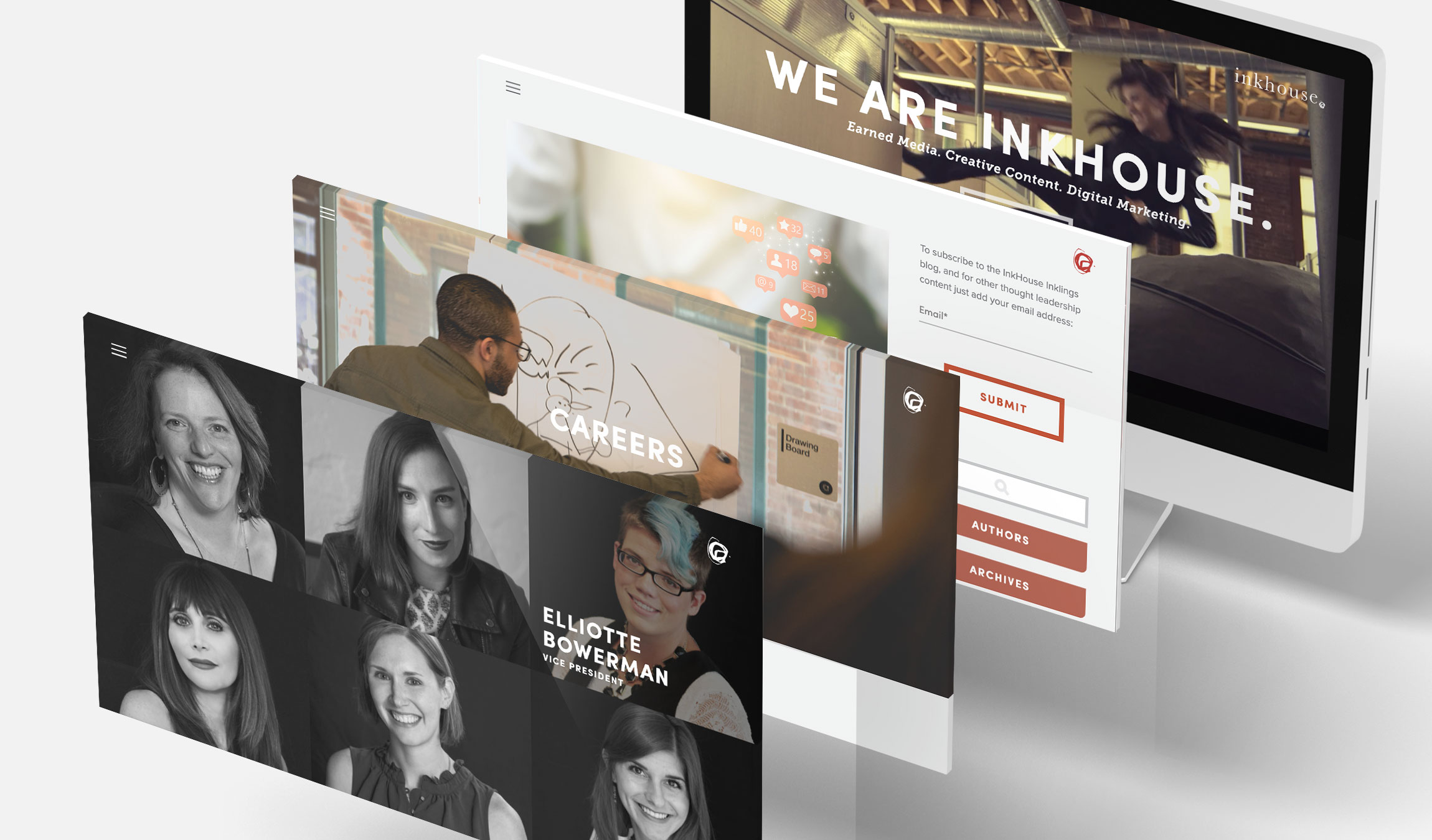
The art direction of the imagery was greatly influenced by the use of filters in social media platforms. A slightly washed, warm tone was applied to all imagery to create an ethereal effect across each page. The button styles and UI were kept simple yet bold with thick strokes around buttons and squared edges. The color palette pays homage to the former brand’s red accent color but with a slightly more salmon hue to soften the appearance. Other secondary colors were also introduced to add coolness to offset the warmth of the images, headlines, and icons.
