Redesign and improve the user experience among the product pages to better reach the desired product as well as create a new art direction that will elevate the product images and create a better system of categorization.
Reorganize and reduce the amount of clicks it takes to locate a product while also revamping the visual style of the site to reflect the innovative and variety of newly acquired product lines. Design an icon system that represents each of the product lines to better assign and coordinate relevant products across the site.
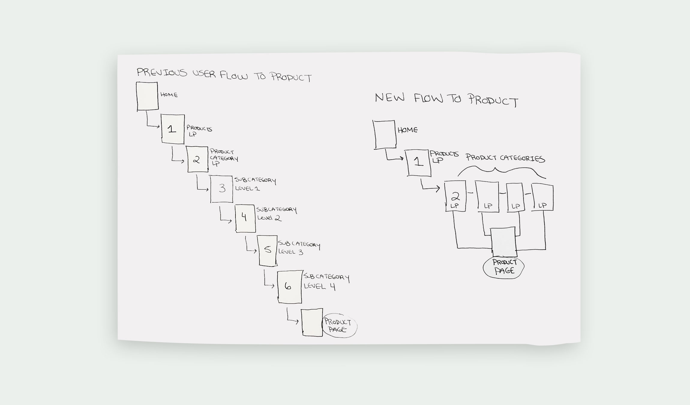
The original path took 6+ clicks to locate a specific product. With multiple levels of landing pages, the user became lost and frustrated as most users know the exact product they are looking for. To improve the flow, the products were grouped into 4 categories, all with their own dedicated subpage. The result reduced the number of clicks to 2.
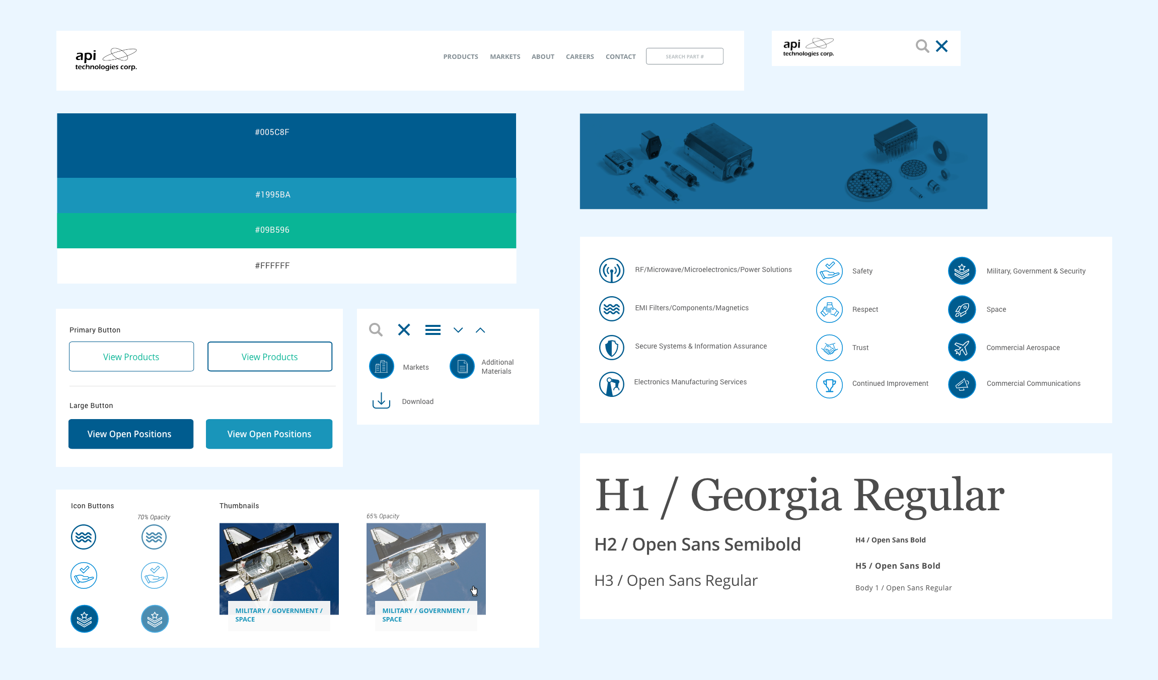
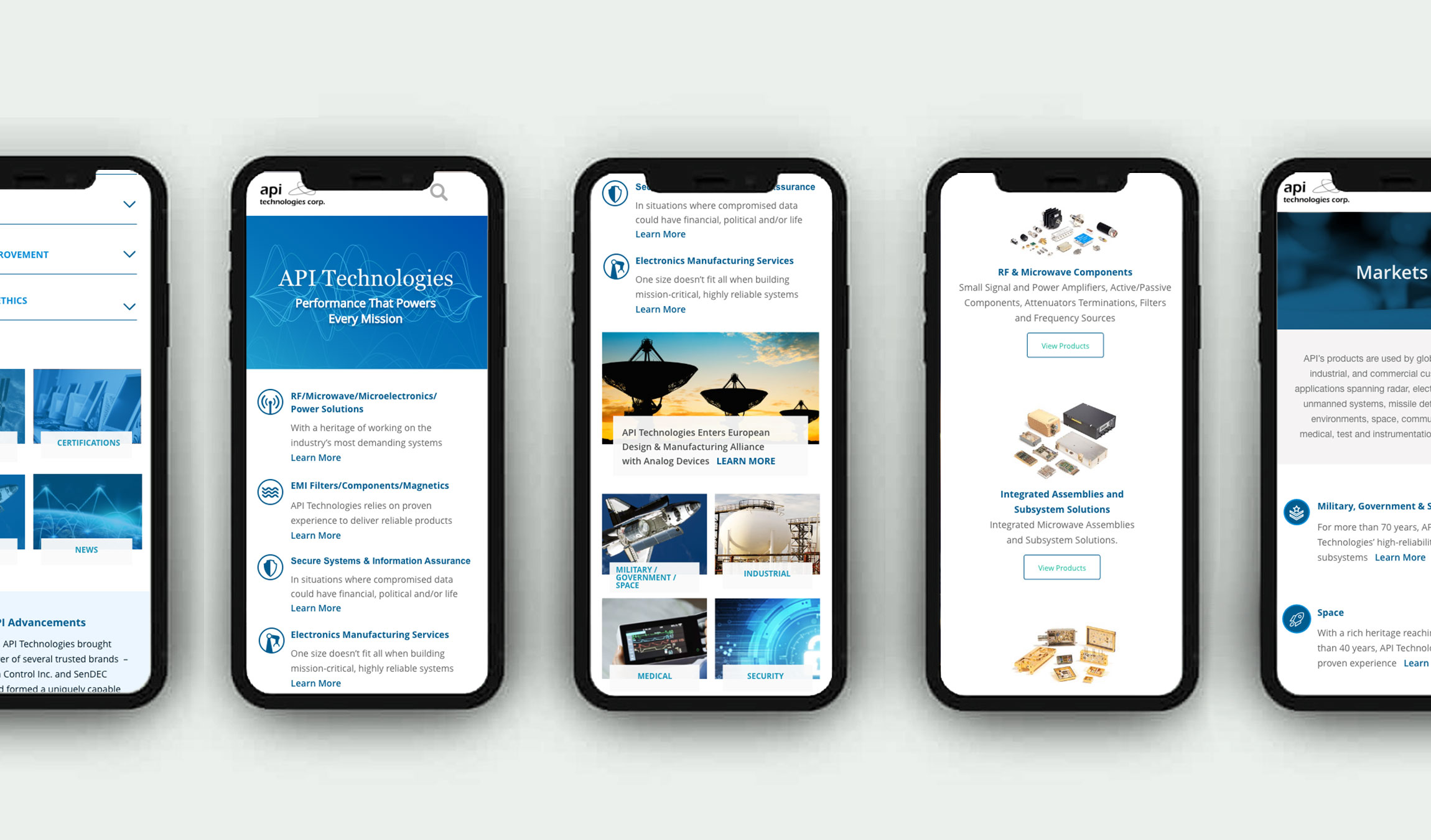
The UI was completely refreshed to include brighter shades of blue along with a vibrant accent green for highlight. The UI was built using atomic principles as each was designed individually then grouped accordingly to create modules and an asset library.

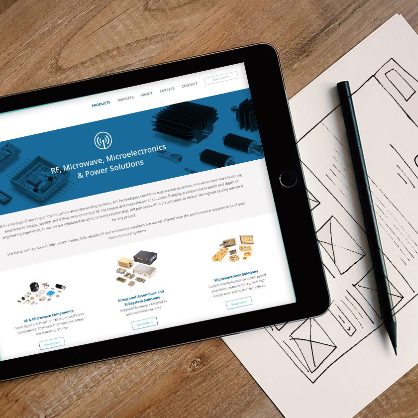
The homepage design incorporated a soundwave graphic as a hero image, influenced by the technology behind some of the audio product lines and their function. The homepage also features 4 main pillars of products to help search functioning and navigation. The color overlay on product pages create uniformity as each product line looks drastically different from one another. The overall aesthetic focuses on the product images themselves with intentional use of color to assign hierarchy and offset the lack of color within the products.