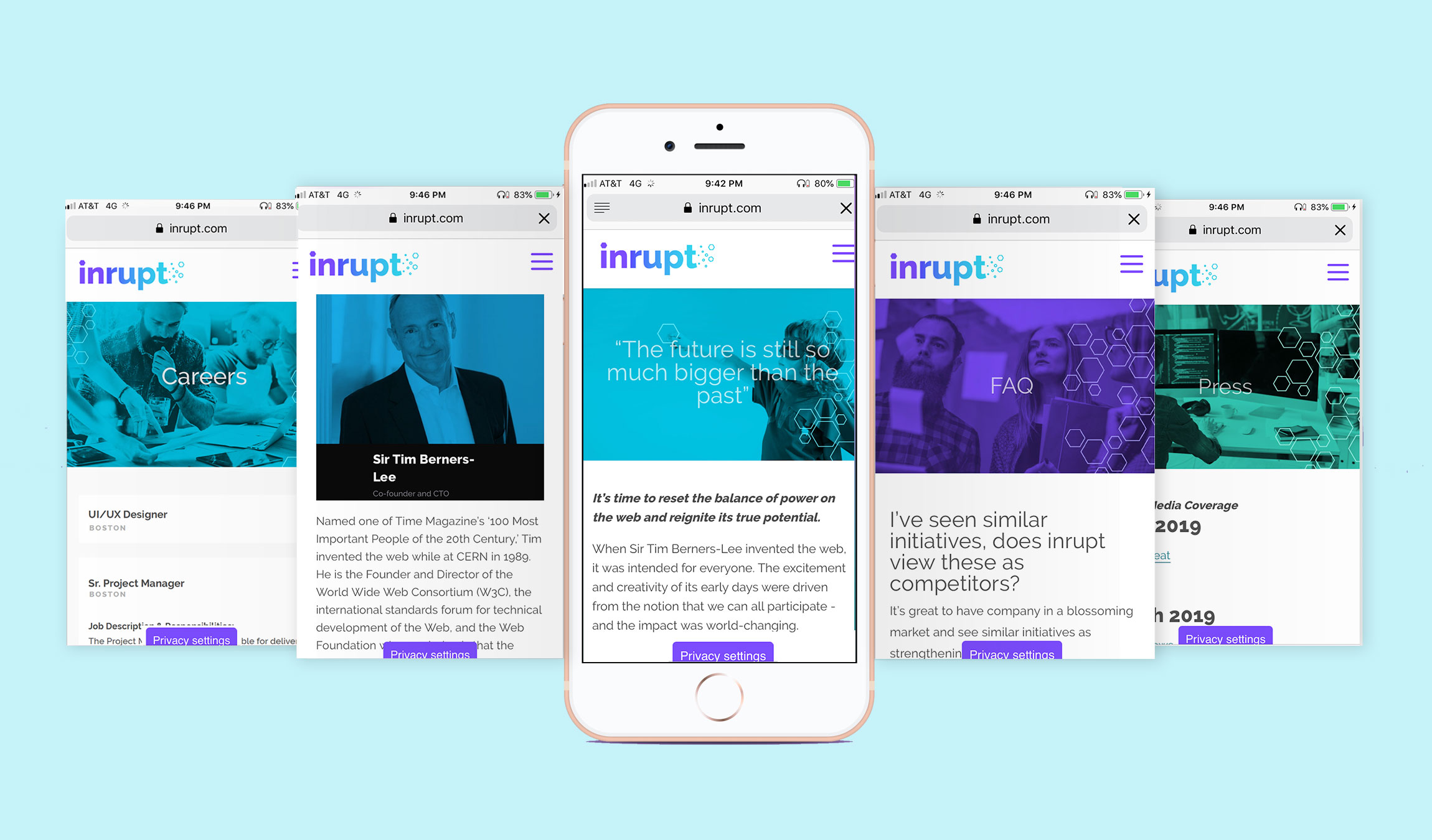
Create the identity for a startup that attracts both investors and the developer community. The website should reflect inrupt's trustworthiness and role as a pioneer in the decentralized web. The website should also serve as the hub for information about the Solid platform and inrupt’s role as the company behind the launch of the platform.
Merge visual elements from the Solid platform but also maintain inrupt's brand integrity as its own entity and service. Build a website that serves multiple functions as a hub: to inform the user, to open conversation about the decentralized web, and to make the team memebers visable and accessable to the Github and developer communities.
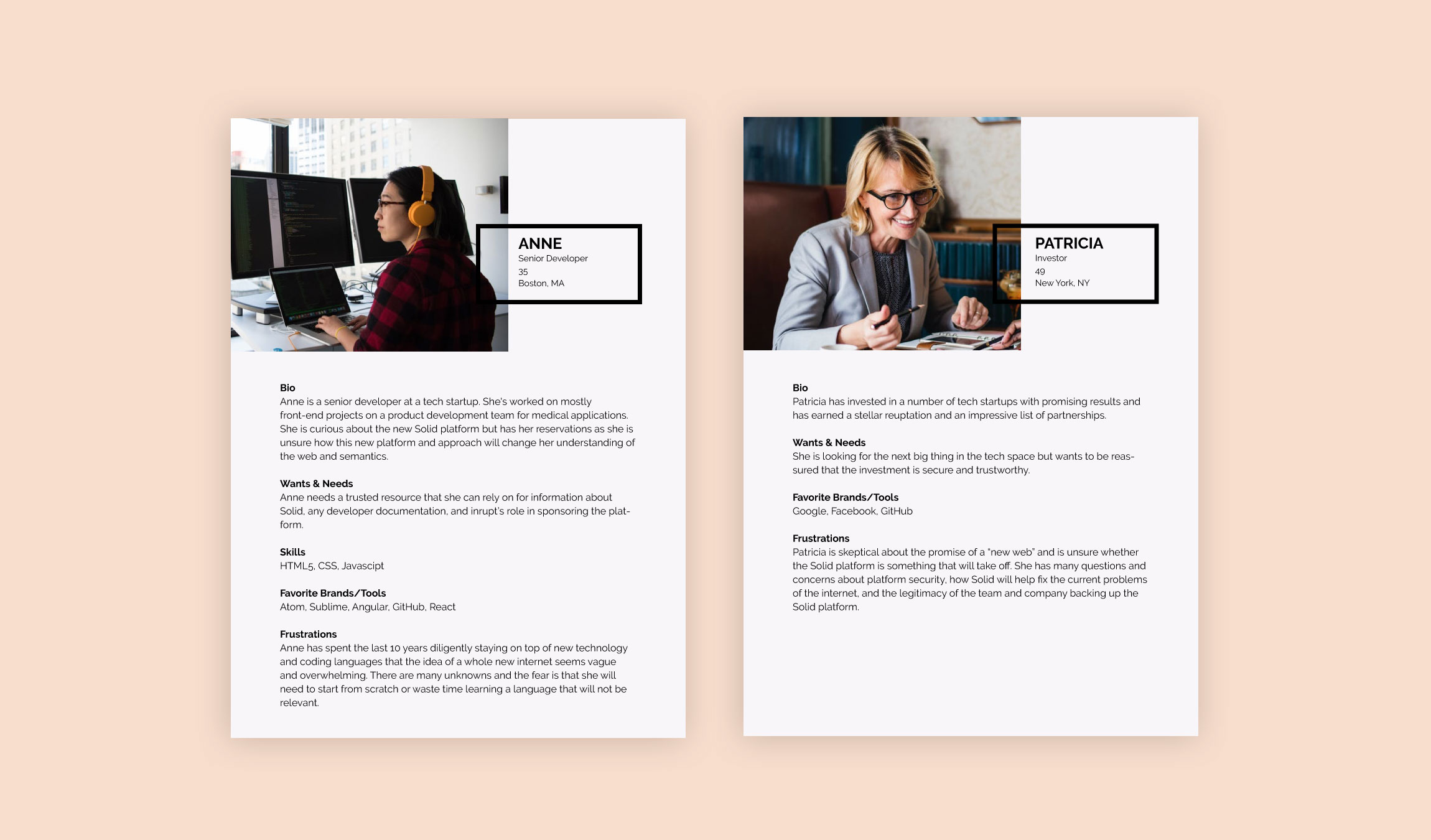
The initial step was to research inrupt’s top two audeinces: web/software developers and potential investors. Through interviews and feedback from both communities, personas were created for each stating their frustrations and relationship towards a company like inrupt.
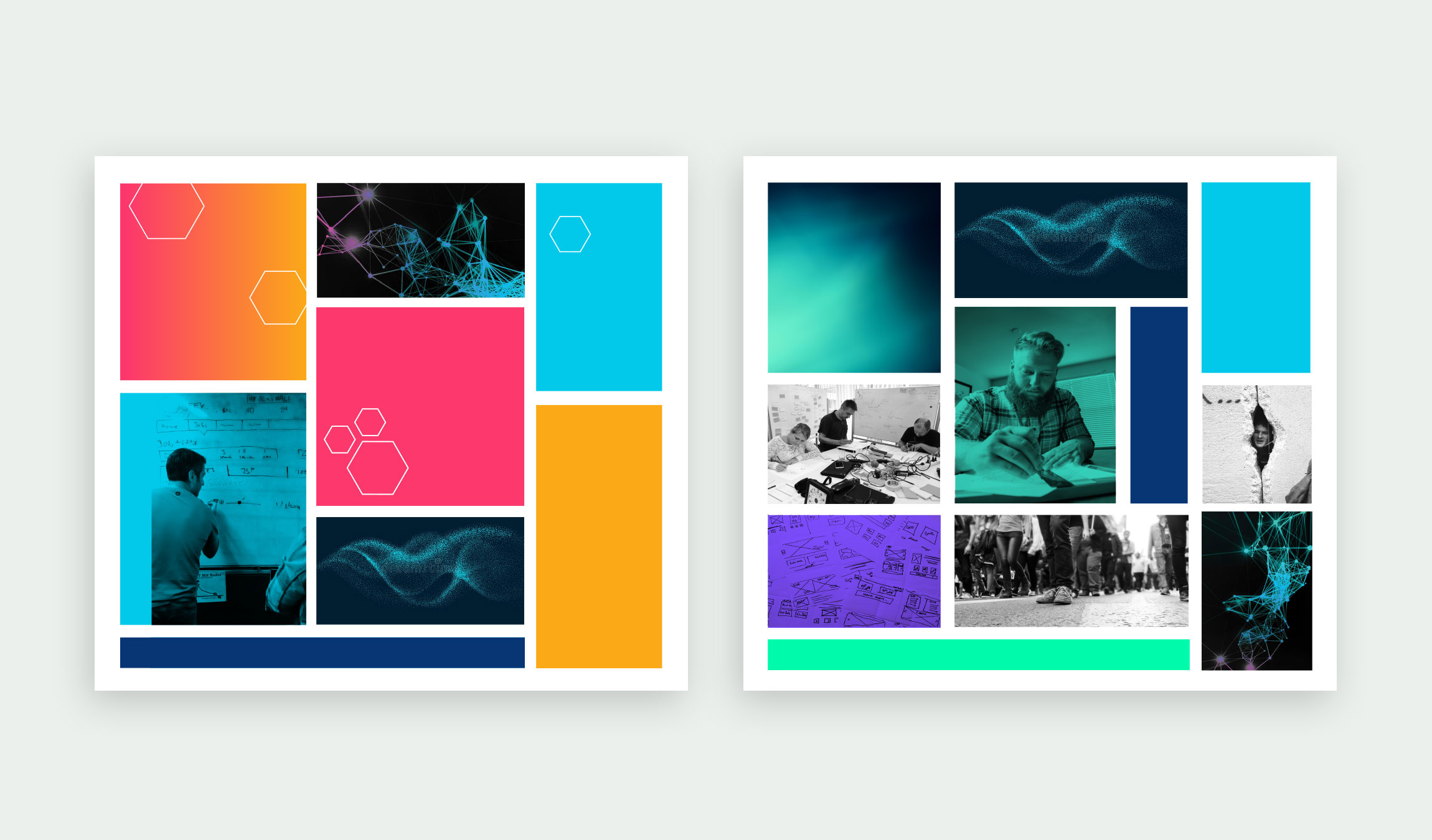
Mood Board Exploration - Option 1: The repeating hexagon is representative of the hive mind concept where users can use linked data to search relevant terms and add to existing data. The hexagon also pays homage to the Solid logo. The color palette was extracted after researching colors seen in common developer tools (i.e. GitHub, Atom, Angular, etc) to choose a palette that was familiar and bring a sense of comfort. The research allowed us to see a pattern in bright, flat, saturated colors that are fun and youthful. Option 2: The second version uses all cool tones which evoke more of a tech vibe. The imagery demonstrates activism and change as the message portrays the disruption of a broken system as well as the social impact of Solid for its user's privacy and freedom of expression.
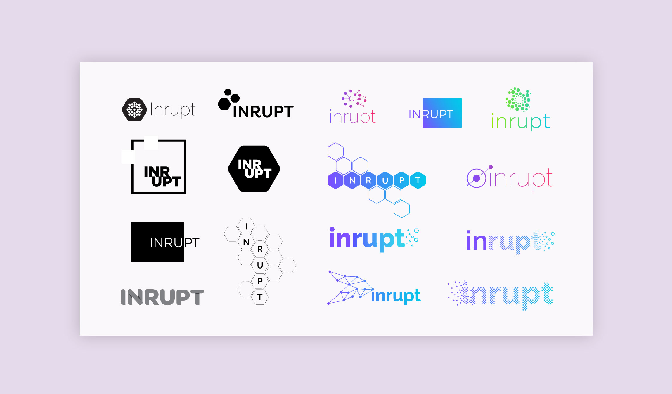
The identity explored a number of methods behind “disruption”, “interruption” and “innovation”. Initial drawings displayed broken lines, overlapping segments, and particles coming together and breaking apart.
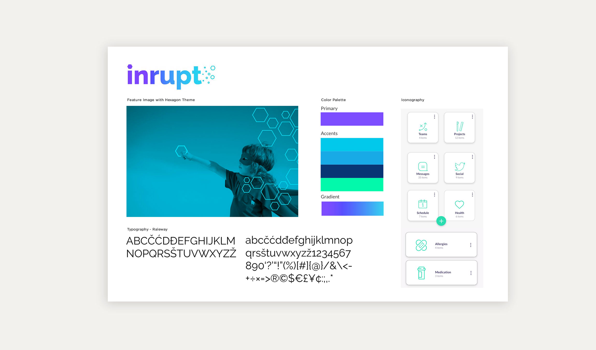
The final moodboard merged the hive mind concept, technical coolness, and inspiring photography to encourage the user to engage. The main image of the child holding the hexagon illustrates the freedom and childlike wonder that Solid enables its users to create without silos and borders. The type palette uses Raleway is its primary font which embodies wider, rounder, and slightly playful accents with the overlapping “W” and hints of a serif in the “d” and “q”.
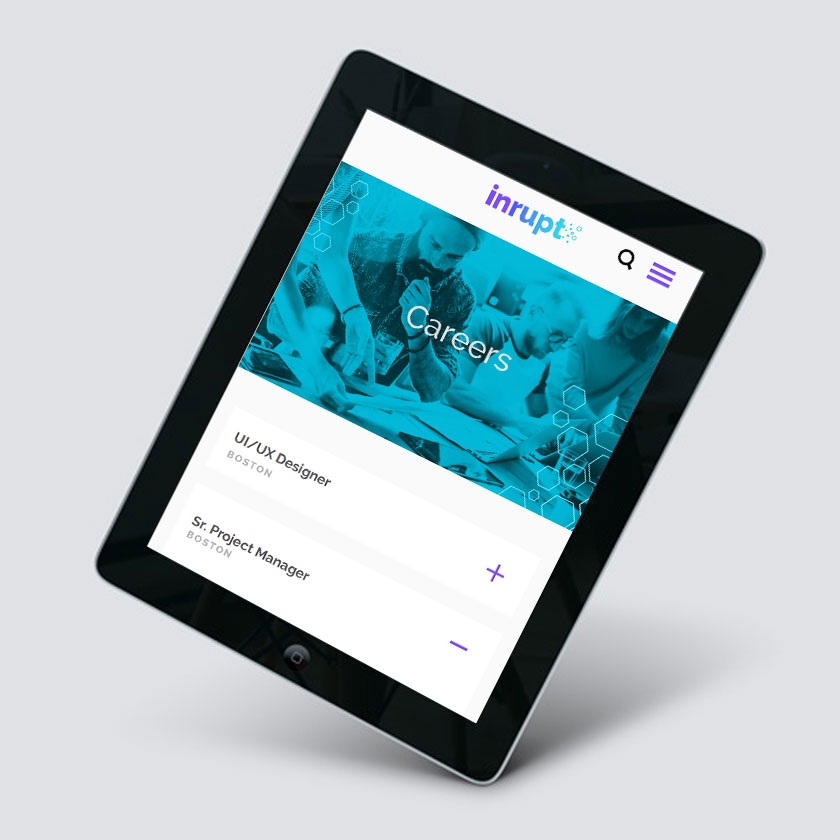
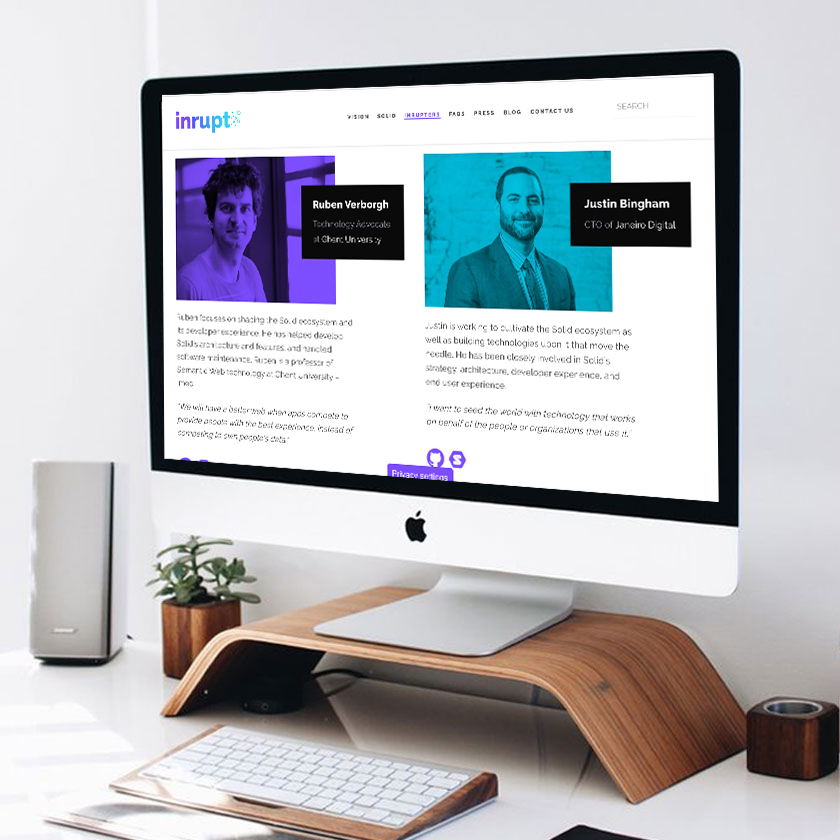
The visual design utilizes the hexagon pattern throughout the headers to create a consistent motif that carries along each page. The images themselves are monochromatic with variations in color on each page to alternate the color platte while creating a subdued, stylized overlay for each image. The logo is purposefully in lowercaps to make the brand approachable and informal. The use of purple within the gradient is the same purple as the Solid logo which then evolves into its own tone of blue (again, paying homage to the Solid brand). The hexagons at the end of the logo give a sense of effervescents to illustrate the spread of information within the hive mind network.