Redesign the ERA website to embody the passion and movement behind the passage of an equal rights amendment. To offset the often difficult and serious tone of topics discussed by the ERA, the client requested the website focus on the celebratory energy around the amendment being passed after 47 years. The UI needed an uplift to help elevate the brand to something less monochromatic and more dimensional.
Rework the color palette to include vibrant colors but also nod to the previous brand with the use of a dominant purple. Curate photography that shows the activism and energy behind the movement, including men and women. The site will evoke an approachable, youthful, and powerful vibe
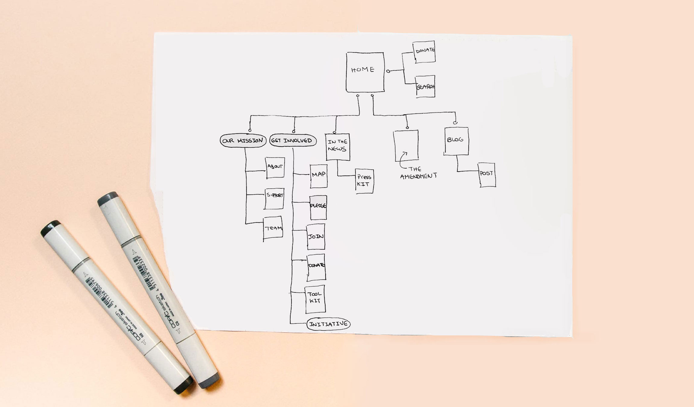
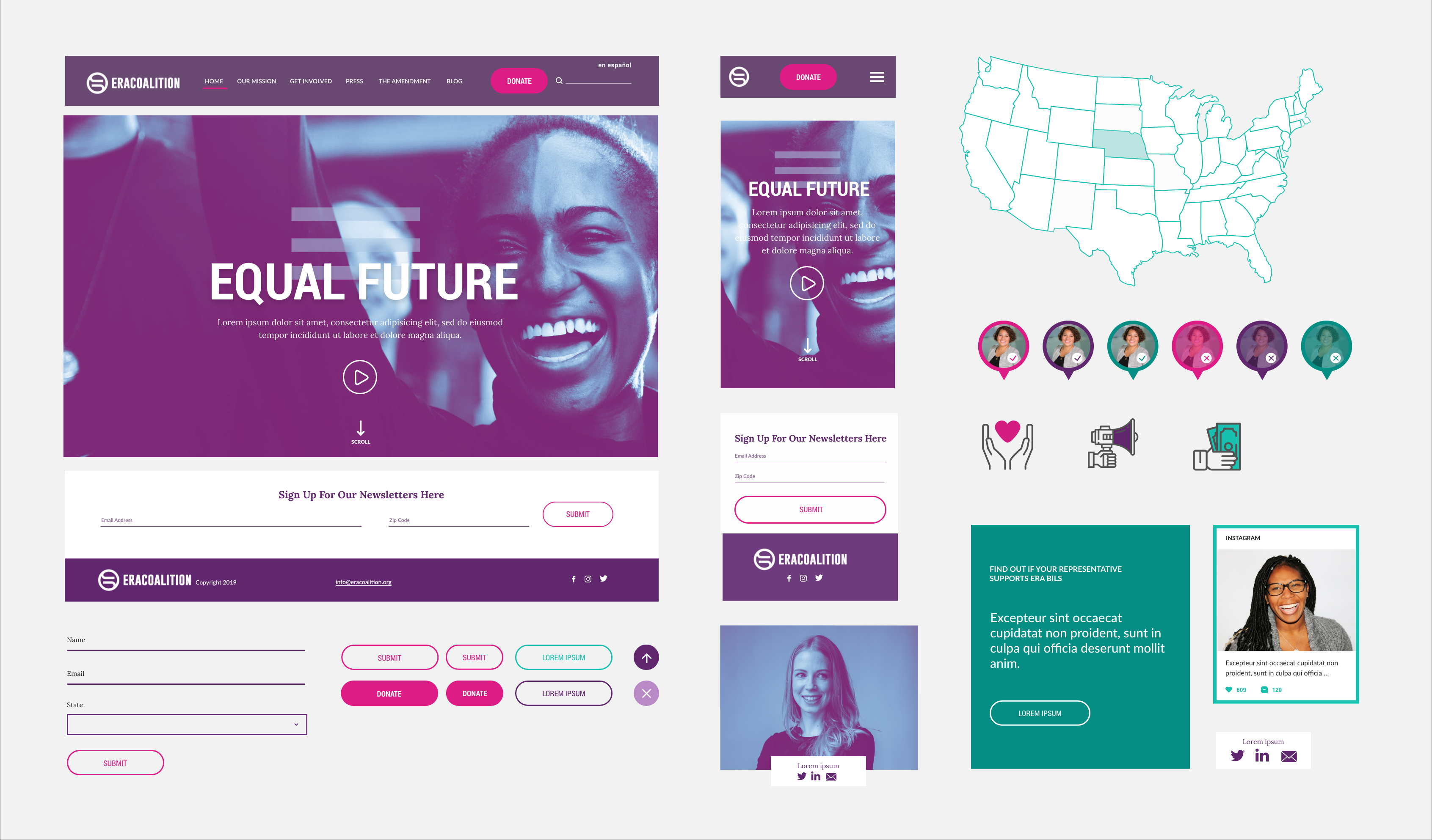
Began revamping the user experience by condensing the navigation and grouping relevant pages within the sitemap. To emphasize and drive users towards donating, the Donation page is located in two areas. A blog was also added to improve SEO value and inform users about upcoming events and discussions.
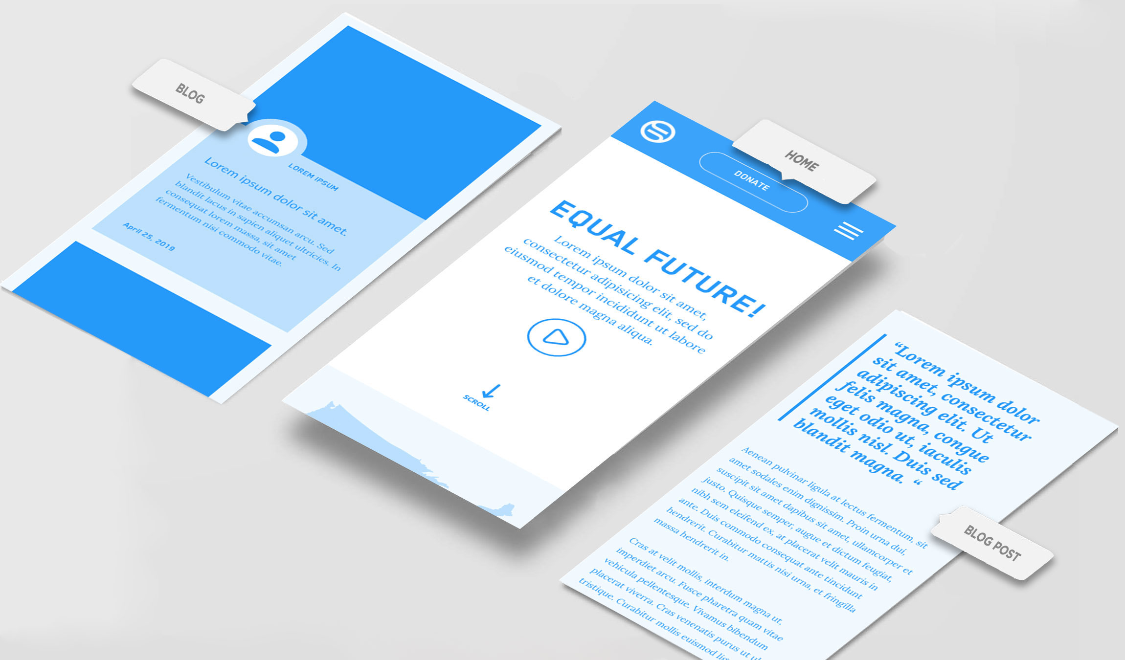
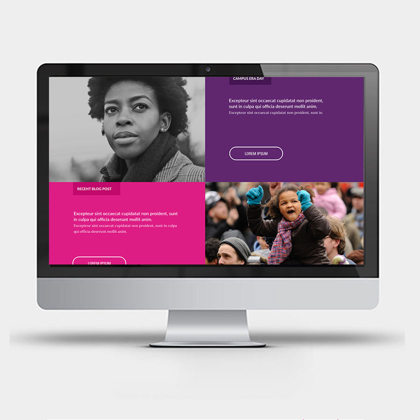
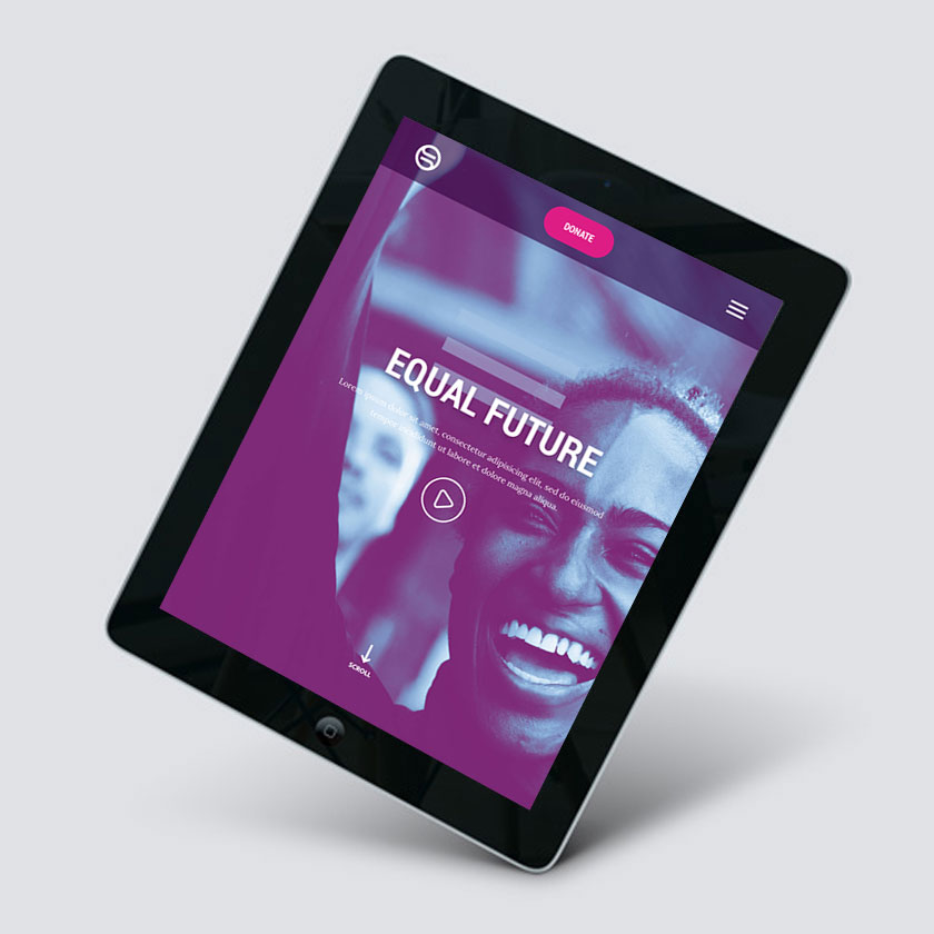
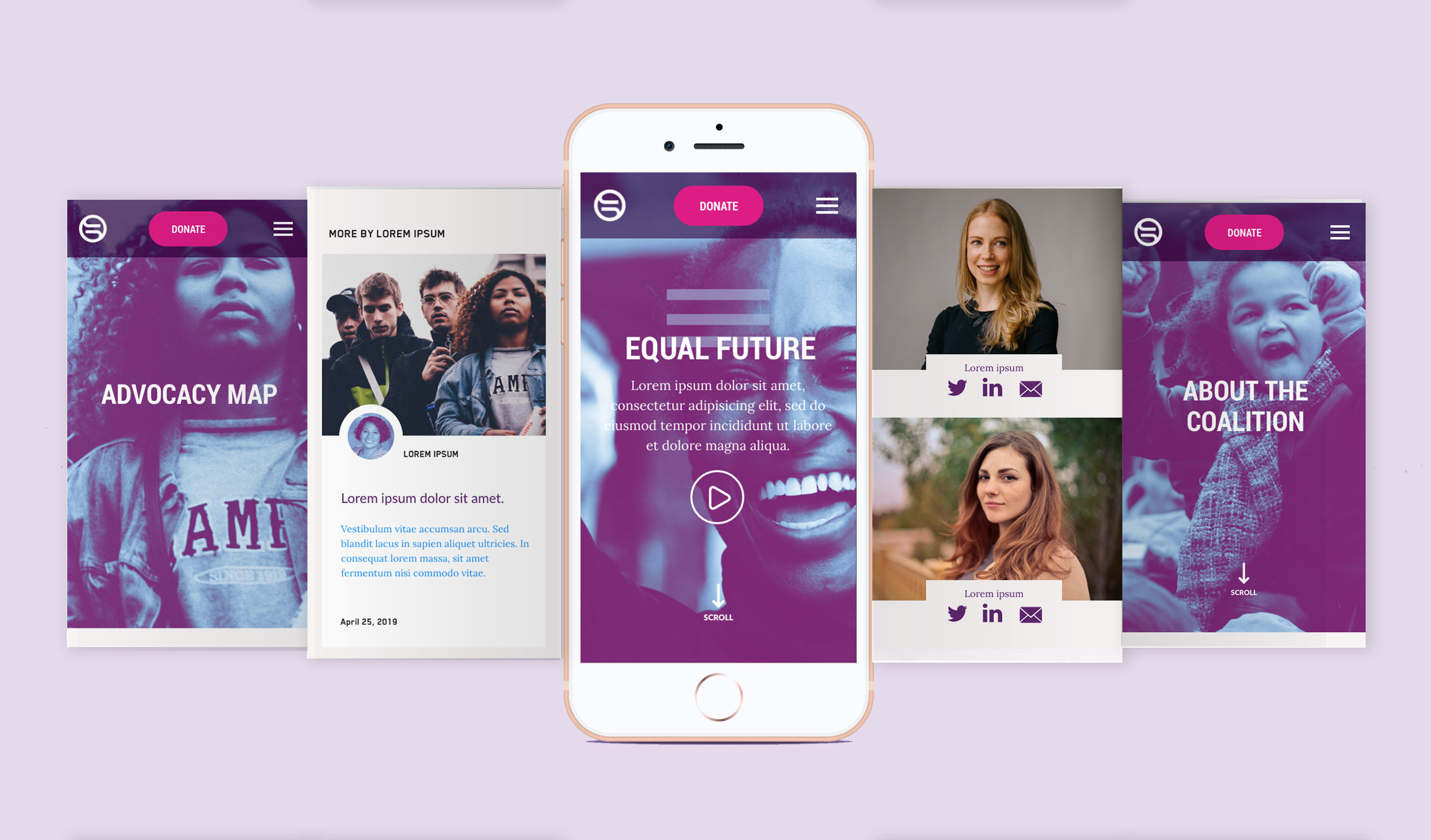
In the wireframes, the heirarchy of every page begins with an omnipresent donation CTA in the navigation to encourage users to click. Longer pages have a scroll indicator in the headers as there will be paralax effects as you continue to navigate down the page. Blog posts are grouped as “cards” with the authors headshot included on all posts.
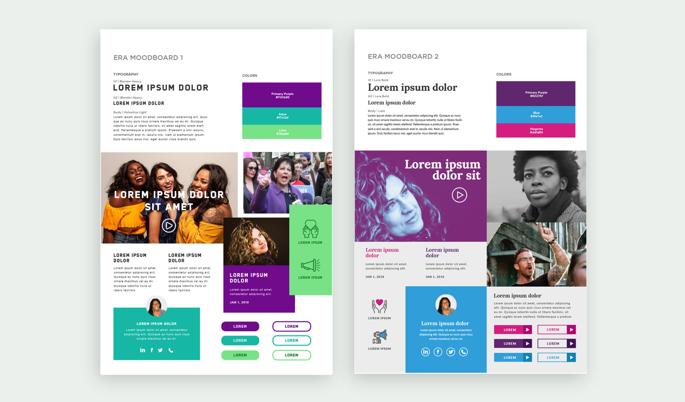
Mood Board Exploration - Option 1: The first moodboard incorporates mostly cool tones and adopts the font Blender to bridge the gap between former branding and this new art direction. Helvetica is used to elevate the body copy to a more sleek and neutral typographic palette. Graphic elements and images overlap to break the grid and add some unexpectancy. Rounded corners on the icons give a friendly tone that adds to the approachable nature of the site. Color photography mixed with flat design gives a vibrant, polished approach. Option 2: This version uses a main purple with a warm accent of magenta. The feel is feminine but also active and a celebration of equality for both genders. The use of duotone adds texture and gives the photography an edge. Icons are multicolored and buttons have dimensions with sharper corners. The serif H1 gives the page a warmer opening and creates a more human, inviting tone.
Once the mood board was finalized, the UI elements were constructed using atomic design principles where modules were created and grouped to build a design system for the website.
The use of a solid magenta button is reserved for Donation-only CTAs to achieve the highest level of priority while the remaining buttons do not have a fill and only a stroke color. The final imagery combines duotone photos, black and white, and color for a youthful variation of tone and alternating perspective.